
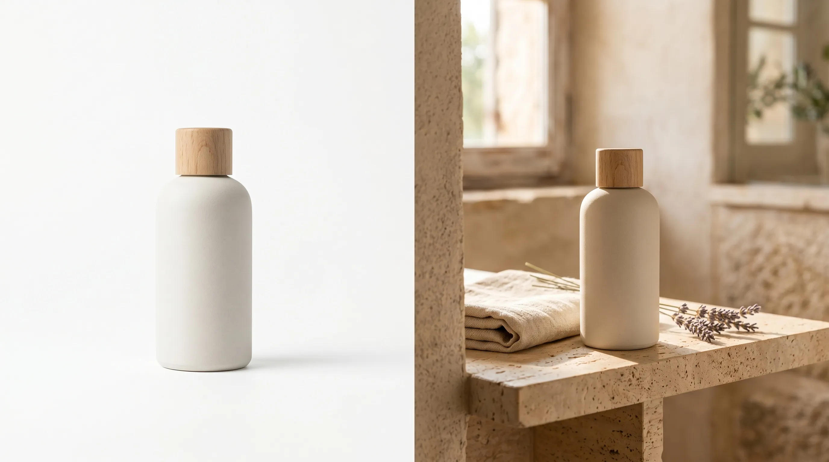
Quick Answer
Neither photo type wins universally. Use a clean white-background image where marketplace rules require it and where the buyer needs to compare products quickly. Use lifestyle images to explain use, context, or scale in ads and the product gallery. A useful starting sequence is a clear lead image followed by lifestyle and detail views, then test the order on your own store. Compliance is a requirement; a conversion advantage is something to measure.
The Real Question Is Not Which One Wins
The lifestyle versus white background debate is older than ecommerce. Catalog photography in the 1990s already separated the packshot from the editorial image: one for grids and references, the other for hero pages and brand world. Ecommerce inherited the split and made it operational. Marketplaces enforce it on the main slot; DTC sites recommend it as a gallery convention.
Most articles answer "which converts better" with a vague "use both," then quietly recommend whichever type the publisher happens to sell. That is not a decision framework. It is a marketing position dressed up as advice.
The variables that actually drive the decision are funnel stage, placement slot, marketplace rules, and category. Aesthetic preference is downstream of all four. A sneaker brand running Meta ads does not need the same image as an Amazon main slot. A furniture brand selling on a DTC site does not need the same image as a Google Shopping feed for non-apparel.
There is also a production reason this debate persists. A styled location or on-model shoot can require more setup than a packshot, so brands may ration lifestyle imagery. That gap depends on the brief, not a universal four-to-ten-times price. Nightjar makes producing both more practical when you already have real product references: a flat background color guides listing-style work, while a saved Background supplies a scene. Parallel Recipes reuse the direction for each set without rebuilding the brief.
Lifestyle and white background product photos serve different funnel stages and platform slots. The strongest ecommerce listings use both, in a deliberate order, rather than choosing one.
What the Conversion Data Actually Says
The best evidence supports giving buyers the visual information they need, not a universal winning background. In Baymard's usability testing, 56% of users' first actions after arriving on a product page were to explore images. Low resolution and insufficient zoom obstructed that inspection. Its in-scale image research found 42% of users tried to judge size from images.
Those findings support clear details and context. They do not say that changing a white background to a lifestyle scene lifts conversion by 10%, 20%, or 30%. A lifestyle image may clarify how a chair fits in a room; a plain image may make two finishes easier to compare.
A+ Content is also a package of changes, not an isolated background experiment. Amazon's own guidance discusses sales gains for Basic and Premium A+ Content, which can include text, comparisons, video, and enhanced images. It cannot establish the causal lift of lifestyle photography alone.
Returns belong in the test as well. An image that creates a false expectation about fit, color, or included accessories can win a click and still disappoint the buyer. Use your own return reasons to decide whether the added context helps; do not infer a photography-caused return rate from general ecommerce averages.
The Funnel-Stage Decision Matrix
The slot is the starting variable, not a universal ranking of image types. Consider lifestyle for feed ads and social, clean consistent images for comparison grids, and the required main-image treatment plus explanatory gallery views on marketplace listings.
That single rule covers most of the question. The matrix below is the operational version.
| Funnel stage | Placement | Starting image choice | Why |
|---|---|---|---|
| Awareness (TOFU) | Meta and TikTok feed ads, Pinterest, Instagram organic | Lifestyle | Blends with feed; context can explain use or aspiration |
| Awareness (TOFU) | Google Shopping (non-apparel) | White background | Platform convention; clarity on a competitive grid |
| Consideration (MOFU) | Collection grid, category page | White background or consistent on-model | Grid scanability across SKUs |
| Consideration (MOFU) | Email and retargeting ads | Lifestyle | Already past initial click; emotional reinforcement |
| Decision (BOFU) | PDP main image | White background (marketplace) or clean hero (DTC) | Trust, clarity, marketplace rules |
| Decision (BOFU) | PDP gallery slots 2 to 8 | Lifestyle, detail, in-scale, on-model | Answers "how does it fit my life" |
| Decision (BOFU) | Amazon A+ Content / enhanced sections | Lifestyle plus comparison | Explain use and differences; test the whole content set |
Two patterns hold across the matrix. First, the further down the funnel, the more the buyer needs context, scale, and material detail rather than a clean reference image. Second, platform conventions (Amazon main, Google Shopping non-apparel) override aesthetic preference in any slot that the platform controls.
The Listing-Slot Recipe (PDP image 1 to 8)
Here is an eight-slot planning example, not a tested universal order. Omit redundant slots and bring the most important buying question forward:
- Slot 1: clean white-background hero or marketplace-ready packshot.
- Slot 2: on-model or in-context hero, the brand-world image.
- Slot 3: detail, texture, or material zoom.
- Slot 4: in-scale shot (next to a hand, on a person, in a room).
- Slot 5: secondary lifestyle scene with a different mood or use case.
- Slot 6: feature or spec callout (graphic overlay on white is fine here).
- Slot 7: variant or colorway grid.
- Slot 8: packaging or unboxing.
The image-first behavior is a reason to make the sequence useful from the beginning. It does not prove a fixed attention share for each slot. Front-load the detail that matters most to this category; packaging or specifications may deserve an earlier position when they decide the purchase.
Marketplace Rules That Override Preference
Some platforms constrain the main image; others leave room to test. White is a common marketplace requirement, not a universal conversion rule. Check the current category guidance before applying the table.
| Platform | Main image rule or recommendation | Lifestyle elsewhere | Source |
|---|---|---|---|
| Amazon | Actual product on white; generally RGB 255,255,255 and 85% frame fill; no added text, logos, or watermarks over the image | Additional images and A+ can show context, subject to content rules | Amazon image guide, Seller Central |
| Walmart | Seamless white generally; larger items may appear in an expected environment; current general guide lists 2200x2200 and 1500x1500 minimum for zoom | Additional contextual images subject to category rules | Walmart Marketplace |
| Shopify | No universal white-background rule; choose a consistent ratio for the grid | Yes; test the gallery in your theme | Shopify product media |
| Etsy | Own photos of the actual finished item, with limited exceptions; square or landscape lead image, 2000px width and height recommended | Real lifestyle photos can show context; generated scenes are not a blanket listing-photo exception | Etsy image guidance, listing requirements |
| Google Shopping | White or transparent recommended; clear staged/lifestyle images also acceptable; clothing can be on-model, non-clothing accessories alone in main | Additional images and a separate lifestyle-image field | Google Merchant Center |
Inherent product branding is not the same as an added logo overlay. Keep the actual packaging and marks accurate. For AI imagery, Google's source-metadata requirements apply, and Amazon requires the XMP dc:subject keyword contains-synthetic-performer before uploading photorealistic synthetic people to listings or A+ Content worldwide. That requirement does not cover images without people, non-photorealistic figures, real people (including AI-edited photos), or characters from expressive works. A white background alone does not establish policy compliance.
A practical note for sellers running on multiple channels: the same product usually needs at least two main-image variants, one that meets Amazon and Walmart rules and one for the DTC store where a clean hero with a soft background still passes. Reuse the product references and visual direction for suitable generated variants, while retaining actual photographs wherever the destination requires them.
Category Adjustments
The matrix above is the default. Different verticals weight the choice differently, and ignoring category is where most generic advice falls apart.
Apparel and footwear. On-model images can explain drape and styling; flat lays make construction easier to inspect. Google Merchant Center recommends worn images for clothing but shows non-clothing products such as shoes or handbags alone in the main image. On your DTC site, test the lead image. Generated fit is not evidence of actual fit; keep real size and material references.
Beauty and skincare. Lifestyle imagery (texture, hands, vanity) drives emotional pricing justification, while a clean packshot still wins the marketplace main slot. Avoid implying ingredient or efficacy claims through imagery that the product cannot back up.
Home goods and furniture. In-room context is effectively required, because shoppers cannot judge scale from a packshot. Baymard's research finds that 42% of users try to grasp product size from images and 28% of sites fail to provide an in-scale image. A room view should agree with the actual dimensions; generated context is not measurement evidence.
Food and beverage. Tabletop and in-use scenes drive appetite appeal. The packshot is often the second image, not the first, on DTC sites; on marketplaces, follow the category's main-image requirements.
Electronics and tools. Google Shopping policy and shopper expectation skew clean white background as the primary. Lifestyle works in secondary slots and in ads, where the buyer has already chosen to engage.
The Production Economics That Used to Force the Choice
Production scope can force a choice. A packshot on a repeatable setup may be inexpensive; location access, models, styling, and new scenes can add labor. Do not assume every lifestyle image costs four to ten times a packshot.
ProShot Media's published rate card illustrates why a real quote matters: general white-background products are $15/photo plus a $100 project setup, while studio lifestyle sets list $19/image plus $139 per scene. Larger productions may cost much more. A fixed ratio would misdescribe both.
For a deliberately hypothetical 200-SKU refresh, assume one $40 packshot and five $150 lifestyle/on-model images per SKU: 200 x $40 + 1,000 x $150 = $158,000. That calculation illustrates the chosen rates and shot mix; it is not a market average or proof that every catalog exceeds $200,000. Ask which setup, styling, retouching, and rights are already included before adding overhead.
Nightjar charges by Credits rather than by whether a single image is a packshot or lifestyle scene: at 1K/2K each completed single image uses 1 Credit, at 4K it uses 2. The Studio plan starts at $25 for 150 Credits. Source capture, direction, corrections, and approval still affect the finished-set cost. The gain is being able to reuse a brief for both types, not a claim that their complete production cost is zero.
There is a second, less-discussed historical blocker: visual drift across SKUs. Lifestyle shots from different sessions can drift in color, lighting, or staging. A documented brief and reference frames help a studio keep the set coherent; reusable generative direction is another way to carry those decisions forward. What closes that gap is a way to save visual direction once and reuse it, which is the approach AI product photography tools now take. For a deeper breakdown of the cost math, see the real cost of product photography.
How to Produce Both at Catalog Scale
The unlock is not just lower per-image cost. It is reusable visual direction so the lifestyle set and the listing set look like one brand, not two shoots.
Nightjar's Create flow uses your product references for both directions. Choose a flat color such as #FFFFFF for a listing-style setup, or a Background for a scene. There is no separate listing-or-lifestyle toggle. A Photography Style saves the camera feel, lighting, color, and mood. Product-only images use Framing and, with an explicit flat color, Shadow; model images use a Fashion Model, Pose, and Camera Distance.
A Recipe saves the chosen ingredients, applicable controls, Custom Directions, image count, aspect ratio, resolution, and output format. Products are separate: they retain the subject photos and factual details, while Recipes retain how you want to photograph them. Save one Recipe for the clean set, with a white background and a 1:1 output, and another for a 4:5 lifestyle set with the same Photography Style. Apply each to the next selected Product instead of re-entering the entire brief.
That separation is the reason to choose Nightjar when you need both sets across a catalog: the subject stays organized once, while two repeatable directions handle two different selling jobs. Use Upscale on a reviewed image when a 2K or 4K long-edge version is needed for closer inspection.
Teams share one Library (the team's collection of images and reusable ingredients), one Credit pool, and one ingredient system, so the visual direction lives with the brand rather than one person's account. A founder can build the brand's Photography Styles and Recipes; a marketer or agency partner can apply both Recipes across new SKUs without rebuilding the brief. For more on holding visual direction steady across a catalog, see how to maintain a consistent aesthetic across all your AI images, and for the scene-and-product side, see how to blend a product into a stock photo or background image.
Honest framing: Photoroom, Pebblely, and Claid also offer product-scene workflows; they are not limited to white packshots. Photoroom and Claid also describe tools for repeatable brand or catalog work. Choose Nightjar when its connected Product, Photography Style, and two-Recipe setup fits how your team needs to reuse both directions—not because alternatives lack lifestyle or catalog capabilities. If you have already decided which mode to focus on, the best white background product photography apps and the best tools for realistic AI lifestyle photos cover the tool choice in detail.
How to Test This on Your Own Catalog
The framework above is the default, not a verdict. The strongest move for any specific catalog is to A/B test image order and image type on the top SKUs, where statistical significance is reachable within a reasonable window.
Keep the product, offer, price, and traffic split comparable while changing the image strategy. Choose the success metric and test duration before reading results. Track purchases and add-to-cart behavior, then allow enough time for returns to mature. A conversion win that creates more misleading-photo complaints is not a clean win.
Inspect mobile and desktop separately: the composition may read differently in a small tile, a full-width feed, or a comparison grid. Segment results without treating a small sample as a decisive winner.
Start with slot one when the platform allows that choice, because it is the first view. On a marketplace with a fixed main-image rule, test compliant alternatives or the order of secondary images. For the broader measurement framework, see how to measure product photography ROI.
Frequently Asked Questions
Do lifestyle photos or white background photos convert better in ecommerce?
Neither wins universally. White can satisfy a required main slot and simplify comparison; lifestyle explains context and use. Start with the placement's rules and the buyer's question, then measure the result on your catalog.
When should I use lifestyle photos vs white background photos?
Use white background for the marketplace main image, the category grid, and any context where compliance and clarity matter most. Use lifestyle for ads, social feeds, email, retargeting, and PDP gallery slots two through eight, where context, scale, and emotional reinforcement drive the click.
Does Amazon require a white background for the main image?
Generally yes: pure white (RGB 255,255,255), with the actual product filling at least 85% of the frame and no added promotional overlays. Inherent product text and branding should remain accurate. Check category exceptions and the rules for additional images and A+.
Are lifestyle photos allowed on Shopify and Etsy product pages?
Yes. Shopify leaves the image treatment to the store and theme. Etsy allows real contextual photos but normally requires your own photos of the finished item; it does not give all AI-generated lifestyle listing images a general exception.
What is the ideal mix of lifestyle and white background photos in a product listing?
A useful starting pattern is one white-background or clean-hero main image followed by five to seven gallery images mixing on-model, in-scale, detail, secondary lifestyle, variant, and packaging shots. The exact ratio shifts by category: apparel weights more toward on-model lifestyle; electronics weights more toward clean studio.
Do lifestyle images work better for ads or for product detail pages?
Both, but in different ways. In ads, lifestyle can demonstrate a use or aspiration. On the PDP, it adds context alongside clean comparison and detail images. Neither placement establishes an automatic conversion winner.
Can AI generate both lifestyle and white background photos from the same product image?
Yes. In Nightjar, select the Product separately, then apply a flat-background Recipe or a scene-based Recipe. Reuse the same Photography Style and model choice where appropriate. The Recipes save the direction, not the product photos.
References
- Nightjar - Reusable product photography and pricing
- Amazon product photos - Capture, main images, and A+ scope
- Walmart image guide - Current general and category requirements
- Etsy image guidance - Recommended dimensions and crop
- Google Merchant image policy - Primary-image and metadata rules
- Baymard image resolution and scale imagery - Observed shopper inspection
- Baymard human-model guidance - Apparel and accessory context
- ProShot Media pricing - Current example studio rate card